
In the past few days I spent some time again to participate Maven Analytics’ new challenge, the Rail Challenge. Couple of months since I’ve participated last time, and now it was great to work on some off-work topic again.
Here is my entry and below I’m going to explain few of the stuff I’ve made.
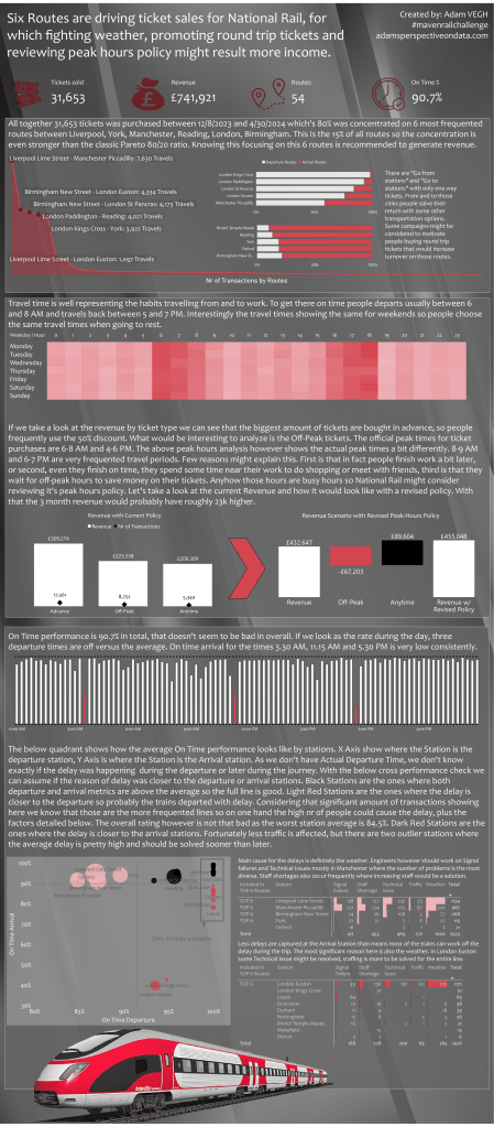
Practicing the New Card visual:
This was the first thing I wanted to practice a bit as I’m using this in my work just a few times. The things that I learned there is how I can align the cards to each others and how I can make the images the same size also to fit the overall view:

TOP Routes Analysis:
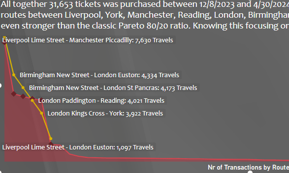
In this part I had to visualize which routes were the most frequented ones. There were actually couple of challenges here.
The first was the routes themselves. I’ve started with concatenating the Destination and Arrival stations, but quickly found that of course some stations are the same just the other way around. I decided to consolidate them and count the two ways as the same route. Here I applied a single logic to name the route with the station earlier in alphabetical order:
Route =
IF(‘Railway Data'[Departure Station]<‘Railway Data'[Arrival Destination]
,’Railway Data'[Departure Station] & ” – ” & ‘Railway Data'[Arrival Destination]
,’Railway Data'[Arrival Destination] & ” – ” & ‘Railway Data'[Departure Station])
The second thing was about the visualization. The second to fifth routes are very close to each others, so if I simply add label to the area chart, most of the labels would not show up well. To override this problem I’ve created a dummy line, to spread the stations vertically and used dynamic label to show only the top 6 routes and not all the 56 ones.
This is the dummy line formula:
Rank line for labels =
SWITCH(
‘Railway Data'[Route Rank]
,1,10
,2,7
,3,6
,4,5
,5,4
,6,2
)
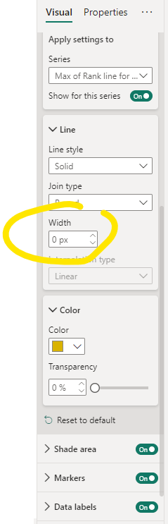
And this is how the line itself looks like on the graph without hiding it:
The only thing I had to do is to make the pixel size of the line to 0 and hide the markers:

Then I created the label as a calculated column:
Transaction by Routes Label =
IF(‘Railway Data'[Route Rank]<=6,’Railway Data'[Route] & “: ” & FORMAT(‘Railway Data'[Transactions by Route],”#,##0″) & ” Travels”)
And added this field as dynamic label on the above explained dummy line:

Peak Hours Analysis:
Actually this is the part I sent the less time in the project. The first part of the dashboard is a single heat map with matrix visual. The thing that I had to do here is to extract the hours of a day from the journey time and the day of the week from the journey date.
Then I realized that peak hours are slightly different in real than how it is officially stated by National Rail. And this is important as National Rail has a pricing policy which give a 25% discount for off-peak hours. So a significant part of the traffic is sold with this discount in the late morning and late afternoon periods, which makes the company a possibility to review it’s policy and earn more on tickets.
The recalculation of the revenue was to choose the transactions affected divide the ticket price by 3 and multiple by 4 adding back the 25% discount:
Price revised policy =
IF(
‘Railway Data'[Ticket Type]=”Off-Peak”
&&’Railway Data'[Ticket Type with Revised Policy]=”Anytime”
,’Railway Data'[Price]/3*4
,’Railway Data'[Price]
)
Than the other thing that we need to do – as the categorization of the tickets is also changing, having Anytime instead of Off-Peak for the specific periods, the following calculation shows the new ticket type:
Ticket Type with Revised Policy =
IF(
‘Railway Data'[Ticket Type]=”Off-Peak”
&&’Railway Data'[Peak Hours Actual]=”Peak”
,”Anytime”
,’Railway Data'[Ticket Type]
)
We now have two ticket types so to visualize the change I’ve created a stand-alone dimension table for the available ticket types:

And created a formula to calculate the values:
Revenue w/ Revised Policy =
CALCULATE(
SUM(‘Railway Data'[Price revised policy])
,USERELATIONSHIP(‘Railway Data'[Ticket Type with Revised Policy],’Ticket Types'[Ticket Type])
)
And finally use a Simple Waterfall to visualize the Revenue and the New Revised Revenue measures by the stand-alone ticket types:

On Time Performance:
The first part of the analysis is about the departure time dependency. It is interesting that over all the routes there are couple of departure times which are very much off the average on time performance. The thing that I’ve immediately saw when checking the first recommended visual is a railway template, so for the visualization I tried to make this one like a railway. Added some border to the white and red bars and as a border for the railway I’ve added a dashed line in the gridlines section on the top and the bottom of the bars.

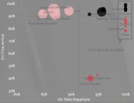
Then I decided to analyze the performance by stations. In the dataset we had an actual arrival time, but we didn’t have an actual departure time. Also if we would have we would know exactly where the delay would happen. With a cross-measuring technique I tried to look at how the performance look like by analyzing the lines by the destination station and departure station. I think that if the metric is high in average in all transactions at the arrival station and good on the department station and vice versa, it can tell us if the delay generated on which end.
Unfortunately some stations had only arrival data, no departure data, those stations could only be analyzed as arrival stations.
But how to get to this view? First I’ve created a Station table that can be connected to the Arrival Destination or Departure Destination in the original dataset. I did it in Power Query by creating two tables, one with the unique values of the departure station, the other is with the unique values of the arrival station and then appending them.
Then creating the basic On Time metric. And some obstacles has come 🙂 . I found that the dataset doesn’t contain a route identifier for a route departed from somewhere in a specific time and arrived to somewhere. So I should find a relatively close assumption for the journey identification. I used the following combination finally:
Journey ID =
‘Railway Data'[Departure Station]
& ” – ” &
‘Railway Data'[Date of Journey]
& ” – ” &
‘Railway Data'[Departure Time]
& ” – ” &
‘Railway Data'[Actual Arrival Time]
Then calculated the On Time %:
On Time % =
DIVIDE(
CALCULATE(
DISTINCTCOUNT(‘Railway Data'[Journey ID])
,’Railway Data'[Journey Status]=”On Time”
)
,DISTINCTCOUNT(‘Railway Data'[Journey ID])
)
After that I’ve used the basic measure both for station arrivals and departures connecting the stations with the basic dataset through one of the other station:
On Time Arrival =
CALCULATE(
[On Time %]
,’Railway Data'[Arrival Destination]=SELECTEDVALUE(Stations[Station])
)
On Time Departure =
CALCULATE(
[On Time %]
,’Railway Data'[Departure Destination]=SELECTEDVALUE(Stations[Station])
)
For the visualization purposes I’ve used a trick to show the stations that doesn’t have a departure transaction at all:
On Time Departure with 1 =
COALESCE([On Time Departure],1)
Then I created the Scatter Chart with the latest metric on the X, the Arrival on the Y and the Stations as the Values. Next I had to calculate the averages and create the quadrants:
On Time Arrival – Avg =
AVERAGEX(
SUMMARIZE(
ALLSELECTED(Stations)
,Stations[Station]
,”ontime”
,[On Time Arrival]
)
,[ontime]
)
same for the departures.
Then I calculated the quadrants:
On Time quadrant =
SWITCH(
TRUE()
,[On Time Arrival]>[On Time Arrival – Avg]&&([On Time Departure]>[On Time Departure – Avg]||[On Time Departure with 1]=1),
,[On Time Arrival]>=[On Time Arrival – Avg]&&([On Time Departure]<[On Time Departure – Avg]||[On Time Departure with 1]=1),2
,[On Time Arrival]<[On Time Arrival – Avg]&&([On Time Departure]>=[On Time Departure – Avg]||[On Time Departure with 1]=1),3
,1
)
And set the coloring of the Scatter Chart based on the quadrant values:
Added the averages as constant lines, and added some minor visual elements to explain the stations without departure info.
The next part was to check the delay reasons. I found that the reasons are somewhat covering each others so some consolidations needed. I’ve consolidated Staffing and Staff Shortage to one, and Weather and Weather Conditions to one category. I was thinking about Signal Failure and Technical Issue, but was not very sure about Signal Failure’s nature and also it’s significance well-founded it’s stand-alone existence.
Also as the reasons are in the original dataset I created a stand-alone table for those reasons, with the single summarize table:
Reason for Delay =
SUMMARIZE(
FILTER(
‘Railway Data’
,’Railway Data'[Reason for Delay]<>BLANK()
)
,’Railway Data'[Reason for Delay]
)
And created a measure to count the related transactions by station:
Departure Routes for Reason =
CALCULATE(
COUNTROWS(‘Railway Data’)
,FILTER(
ALL(‘Railway Data’)
,’Railway Data'[Departure Station] IN VALUES(Stations[Station])
&&’Railway Data'[Reason for Delay] IN VALUES(‘Reason for Delay'[Reason for Delay])
)
)
same for arrivals.
Then I created matrix visual adding the stations, the reasons and the appropriate measures below each others:

And set the data bars for the measure:

And pretty much we are ready. Some minor visualization cosmetics and that’s it. Hope you can use few of those tricks.
Cheers!


Leave a comment